Benefits of customizing the UX for the mobile
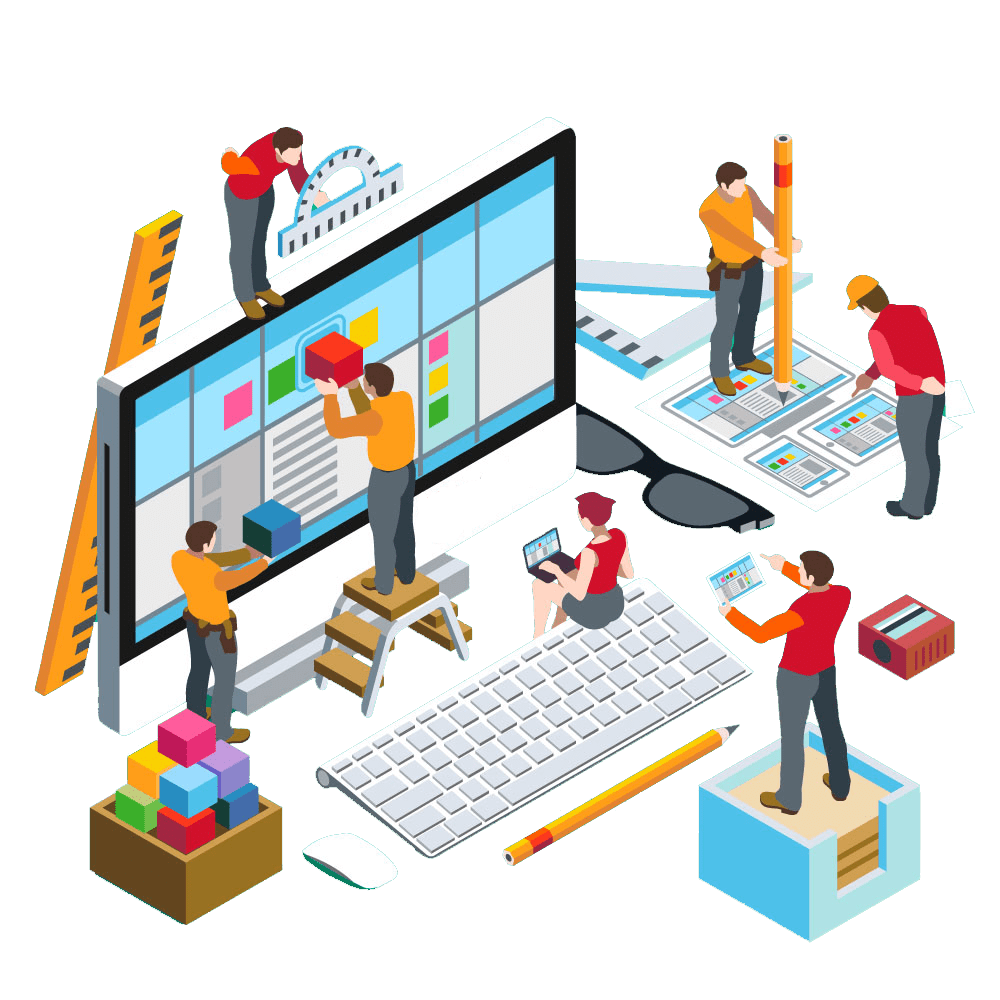
In recent years, something which has developed beyond aesthetics and which has paved the way for development is web designing. It involves planning and creating content online. It is very important to choose a web design tool to create perfectly designed software. Desktop apps like photoshop and sketch design codes to create software. It is a time-consuming and expensive procedure and requires multiple skills, resources, and team members.
It is also very important to invest in a website builder to do this process. Website builders like Webflow, Squarespace, PageCloud, and Wix have excellent design skills and a variety of templates. They also offer at an affordable price with other editing options. It is very important to look for the best platform for research and experiments. Some of the finest website builders include PageCloud which gives a customizable skill as a developer, Wix which has an easy platform with many template ideas. PageCloud also gives a shortcut to many other platforms.
There are two types of web designs – Adaptive and Responsive.
The adaptive web design will let us know the version of the site and the device trying to enable it. This will include a field – ” user-agent ” in the HTTP browser. Another version is the media queries which help in adapting screen sizes. This in turn gives better flexibility for the website. The advantages of adaptive web design include faster customization, the compatibility of a cross-device, and the feature of loading pages fast.
Responsive websites can use layouts based on the percentage composition of each element that takes up in its form. If the header element is 30% of its container, then it will stay at 30% despite the changing size of the screen. Responsive websites also give a custom look for every screen size. They constantly change depending on the screen size. There are tons of templates available for a start-up.
The elements used in a web design like visual elements which include – Images and cons like Shutterstock, Unsplash, Pexels, and IconMonstr, shapes, layout, videos, colors, and fonts. Functional elements include animations, navigation, user interaction, site structure, speed, and browser compatibility. They also have advantages like creating responsive websites without coding, having control without matching elements on the page, and exporting codes to the host.
What are the benefits of customizing UX for mobile and how is it better than a desktop web design?
UX design, that is ‘user experience’ is used in creating and experimenting with a product more efficiently and delightfully. It was originally invented by Donald Norman. Some important elements that play an important role in UX are – The system should be used in a manner it is completely useful for the customer/user, the system needs to be user-friendly and handy for the user, desirable systems that provoke style and navigation faster, making the information easily accessible and credibility for the product. The seamless design is created in order to work simultaneously with a mobile and desktop UX design, hence adding a user-friendly option to it.
Both desktop and mobile devices use symbols and icons to enable the users to work on it effectively. The users of desktop UX face a serious problem of simultaneously opening some other websites and applications, this problem can be easily sorted out using a split-screen option in smartphones as most desktop operators do not use this. Touchscreen facility is enhanced more on a smartphone rather than a desktop as they lack screen options comparatively. This feature can improve the navigation on a smartphone. Smartphones also provide a screen orientation option (both vertical and horizontal), but on desktops, they can only be horizontally-oriented. However, smartphones cannot store a lot of information in them which adds to its disadvantages
On the other hand, a desktop has a widescreen and can also store information in larger amounts compared to a mobile phone. Smartphones are handy and portable and thus add to an environment-friendly option whereas desktops are often used for serious and formal tasks. Personalization is achieved more in mobile phones than on desktop computers.
They help in adding a lot of trusts and bring customers to our side creating a great user experience.
- It involves simple navigation and a wide range of content which is quite engaging which in turn helps in customer satisfaction.
- UX provides consistency in mobile applications thus making them user efficient and productive.
- They also help in improvising sales and credibility.
- It has a low development cost and consumes less time.
- It also adds quality by providing a customized incredible UX design.

Bottom Line:
Thus, mentioned above are the benefits of customizing UX for a mobile phone. As most people are using mobile phone in modern times and businesses uses them to contact their end customer, harnessing the UX in vital.









Leave a Reply